A logo's only job is to be recognized, not to be perfect
New founders tend to treat their logo like a personal artistic statement. In practice, a logo has one job: help a customer recognize your business instantly, in a hundred different contexts, at every size from a favicon to a storefront sign. It needs to work in black and white on a fax cover sheet and in full color on a delivery van. That's a narrower, more practical brief than most founders imagine, and it's exactly the brief Bizvee's free AI Logo Generator is built to answer quickly.
This guide covers what the tool produces, the logo fundamentals worth understanding before you start (even if you never touch design software again), how to write a prompt that gets you something usable on the first try, what file formats you actually need and why, the trademark side of logos that founders routinely miss, and when it's genuinely worth hiring a human designer instead.
What the tool actually does
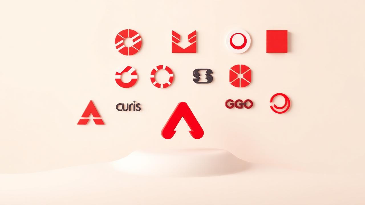
Give it your business name, industry, and a sense of tone, and it generates a set of logo concepts by combining:
- Mark style — wordmark (styled text only), lettermark (initials, like a monogram), icon-plus-wordmark combination, or abstract/emblem style.
- Color palette suggestions, generated with basic color theory in mind — complementary or analogous palettes that fit the mood you describe, along with hex codes so you can reuse them consistently elsewhere.
- Typography pairing, choosing a typeface (or a close web-safe equivalent) that matches your stated tone, whether that's modern and minimal, warm and traditional, or bold and playful.
- Multiple layout variations of your top concepts, including horizontal and stacked versions, since you'll need both depending on where the logo appears (a horizontal lockup on a website header, a stacked version on a square social profile photo).
- Export files in the formats you'll actually need for different uses, which we'll cover in detail below.
What it won't do is replace a trademark attorney's clearance opinion, guarantee the design is fully unique globally, or hand-craft a completely bespoke illustrated mark the way a specialized designer would for a premium brand identity project. For most new businesses in year one, though, it produces something entirely usable, and usable today beats perfect in six weeks.
Logo basics worth knowing before you start
You don't need a design degree, but five basic ideas will make your prompts sharper and your final pick smarter.
- Simplicity wins. The logos that last decades (think of any major bank, airline, or retailer) tend to be simple enough to draw from memory. If your concept needs a paragraph to explain, it's probably too complex.
- It has to work small. Your logo will appear as a tiny circle on a social media profile and an app icon before it ever appears large. Test everything at 32 pixels wide before you commit.
- Color carries meaning, but context matters more than theory. Blue reads as trustworthy in finance, but a bakery in blue can feel cold. Consider what your specific competitors are already using; standing apart from them matters more than any universal color rule.
- Typography sets tone as much as color does. A serif wordmark reads as established and traditional; a rounded sans-serif reads as friendly and modern; a sharp geometric sans-serif reads as tech-forward. Pick the one that matches how you actually want to be perceived, not just what looks nice to you personally.
- Versatility beats novelty. A logo that needs to be redrawn for every different use (letterhead, favicon, embroidered patch, van decal) will frustrate you for years. Choose something that survives simplification.
When to use it
- You're forming your company now and need a logo for your bank account, invoices, and first website, but you don't have design budget yet.
- You're testing a business idea and want professional-looking branding fast to run ads or build a landing page before committing serious money to design.
- You're rebranding after a pivot and need several fresh directions quickly to react to.
- You need a placeholder that's good enough to launch with, with a plan to invest in a custom design once you have revenue.
- You want options to bring to a professional designer as a starting reference rather than a blank brief, which often makes that later engagement faster and cheaper.
If you're a well-funded startup planning a major brand launch, or if your business's whole identity depends on a highly distinctive, ownable visual mark (think a mascot or a very specific illustrated icon), that's a case for hiring a specialized designer from the start. More on that trade-off below.
A great example prompt
As with the other Bizvee AI tools, output quality tracks input specificity closely.
"Design logo concepts for 'Meridian Tax Advisory,' an LLC providing tax preparation and advisory services for small business owners. I want the tone to feel established, precise, and calm, not playful or trendy. Avoid generic tax imagery like calculators, dollar signs, or percent symbols. I'd like a combination mark with a simple geometric icon plus a clean wordmark, in a color palette built around deep navy and a muted gold accent, using a modern serif or a clean geometric sans-serif for the type. I need it to look credible to small business owners who are choosing between us and a larger, established accounting firm, and it needs to work as a small circular profile photo on LinkedIn as well as on a letterhead."
What's doing the work here:
- Explicit tone words ("established, precise, calm") rule out playful directions before they're generated, saving you a round of rejecting options that were never going to fit.
- Named colors with intent, not just "make it look nice." Navy and gold signal a specific positioning against competitors.
- A stated mark style preference (combination mark) narrows the output to layouts you'll actually use, rather than getting five wordmark-only options when you wanted an icon too.
- A specific competitive frame ("credible against a larger, established firm") shapes tone choices in a way that a generic prompt never would.
- A named use case constraint — needing it to work as a small circular profile photo — pushes the generator to favor a mark that survives cropping and shrinking, which is a real, practical constraint most founders forget to mention.
- What to avoid — ruling out calculators, dollar signs, and percent symbols prevents the most overused clichés in the entire tax and accounting category.
What output to expect
For a well-specified prompt, expect three to six real concept directions, each with variations. A useful way to think about what you're looking at:
| Concept | Style | Palette | Best Use |
|---|---|---|---|
| Compass mark + wordmark | Combination, geometric icon | Navy #1B2A4A, Gold #C9A24B | Website header, letterhead |
| "M" monogram in circle | Lettermark | Navy, cream background | Social profile photo, app icon |
| Wordmark only, serif | Wordmark | Navy on white | Email signature, invoices |
| Ascending bar icon + wordmark | Combination, abstract | Navy, muted gold accent | Signage, presentation decks |
You should also receive, for your chosen concept:
- A primary horizontal lockup and a stacked/vertical alternative
- A standalone icon version (useful for favicons and app icons)
- A one-color (black) version and a reversed (white on dark) version for use on colored backgrounds
- The specific hex and RGB codes for your palette, and the typeface name or closest equivalent, so you can stay consistent in future materials
If the output feels visually cluttered or the icon doesn't hold up shrunk down, that's a signal to simplify your prompt's brief rather than settle. Ask for "a simpler, more minimal version of concept 2" rather than starting over from scratch.
File formats you actually need, and why
This trips up more founders than any other part of the logo process. Here's what each format is for:
- SVG (vector) — this is your master file. It scales to any size with no quality loss, which matters because your logo will eventually need to be huge (a banner) and tiny (a favicon). Keep this safe; it's the source of everything else.
- PNG with transparent background — your everyday working file for websites, email signatures, and digital documents where you need the logo to sit on top of any background color without a white box around it.
- JPG — fine for situations that specifically require a flattened file with no transparency, but generally the least useful format for a logo; use PNG or SVG instead whenever you have the choice.
- PDF (vector) — often required by print shops for signage, packaging, or promotional merchandise, since it preserves vector quality at large sizes.
- Favicon-ready ICO or small PNG — the tiny icon that shows in a browser tab; test your logo at this size specifically since detail gets lost fast.
Keep all of these organized in a single labeled folder from day one (something as simple as "Logo – Primary," "Logo – Icon Only," "Logo – White Version") so that whoever builds your website, orders your business cards, or sets up your social profiles isn't guessing which file to use.
The trademark side of logos, which founders routinely skip
A logo is a piece of intellectual property, separate from your business name. That means:
- A generated logo could resemble an existing registered trademark even without either party intending it, especially with common shapes like circles, shields, or simple geometric icons. Before you commit to a final mark, run a basic visual and category search, and for anything you plan to invest real marketing dollars behind, get an actual trademark clearance search done.
- You can potentially register your logo as a trademark separately from your business name. Many businesses register both a wordmark (the name) and a design mark (the logo) because it gives broader protection against copycats using either element.
- If you ever plan to hire a designer to refine the AI-generated concept, get clarity in writing on IP ownership of the final refined version, so there's no ambiguity about who owns what.
- Using stock icon elements or overly generic shapes reduces your ability to claim strong trademark protection later. Distinctive marks are easier to defend than generic ones; something is trademarked based on how distinctive and non-generic it is in your specific category.
- Don't skip a domain and social handle check on your visual brand identity too. It's less about legal risk and more about consistency, but a logo you love that clashes with an already-established visual identity of another business in your space creates real customer confusion.
Mistakes to avoid
- Choosing a logo with too much detail. Anything that looks great at full size but turns into a smudge at favicon size will frustrate you constantly once you're managing a website and social accounts.
- Picking colors before checking competitors. If every competitor in your space uses blue, a distinct color choice (not necessarily a wild one) helps customers tell you apart at a glance.
- Ignoring how it looks in black and white. Faxes, some printers, embroidery, and engraving often strip color entirely. If your logo depends entirely on a color gradient to read correctly, it will fail in those contexts.
- Skipping the reversed (white) version. You will eventually need your logo on a dark background, whether that's a dark website theme, a colored tote bag, or a presentation slide, and scrambling to create one later wastes time.
- Never testing it at real sizes in real contexts. Put it on a mock business card, a mock browser tab, and a mock Instagram profile circle before you finalize anything.
- Treating a placeholder as permanent by accident. If you launched with a fast AI-generated logo to get moving, put a date on your calendar six or twelve months out to revisit whether it's time to invest in something more custom as the business grows.
- Skipping the trademark check entirely because the logo felt "obviously original." Coincidental similarity happens more often than founders expect, especially with simple geometric styles.
When it's worth hiring a human designer instead
The generator is genuinely good for getting a professional, usable identity fast and for very little cost, which is exactly right for most businesses in their first year. Consider a dedicated designer instead (or as a next step later) when:
- Your brand identity is central to your competitive advantage, such as a consumer product business where packaging design drives purchase decisions on a shelf.
- You need a highly specific, ownable illustrated mark, like a mascot or detailed emblem, that goes beyond geometric shapes and typography.
- You're raising a significant funding round and investors will scrutinize brand polish as a signal of overall execution quality.
- You need a full brand system beyond the logo: a style guide, custom illustration set, packaging templates, or motion/animated logo versions for video.
- You've outgrown your original placeholder logo and want something distinctive enough to trademark strongly and defend for the long term.
A sensible path for most founders: launch fast with the AI-generated logo to get your company formed and operating, then revisit with a professional designer once you have revenue and a clearer sense of your actual customer base and competitive position.
How this connects to actually forming and running your company
A logo isn't a separate project from formation, it's one of several identity pieces that need to line up together:
- Match your legal name. Your logo's wordmark should be consistent with (or a clear stylization of) your actual registered legal name from your Articles of Organization or Incorporation, filed through Bizvee's services. If you're using a shorter brand name than your full legal name, make sure you've filed the appropriate DBA.
- Apply it across your official documents. Once you're formed and have your EIN, your logo goes on invoices, your business bank materials, and any printed items Bizvee ships for you through print & ship.
- Keep it consistent on your registered mailbox materials and signage if applicable, so your brand looks coherent from the first customer interaction.
- Consider trademark protection once the business is validated. If you're generating real revenue and the brand is working, this is a natural moment to pursue formal trademark registration for both your name and your mark.
- Revisit it as you grow. Businesses that expand into the UK, Canada, or Australia sometimes find their original color or naming choices carry different connotations abroad; check this before a broader international rollout.
If you want guidance on any part of pulling these pieces together, from choosing a DBA to timing a trademark filing, our contact page connects you with our team, and our blog covers deeper dives on trademarks, DBAs, and brand consistency once you're ready to go further than the basics covered here.
A simple workflow to follow this week
- Write a one-paragraph brief: your business name, industry, tone, and what you want to avoid.
- Check what colors and styles your closest competitors already use, so you can differentiate on purpose.
- Run a specific prompt through the AI Logo Generator using the structure in the example above.
- Test your top two or three concepts at small sizes (a mock favicon, a mock profile photo) before choosing.
- Download the full file set: SVG, transparent PNG, one-color version, and reversed version.
- Run a basic visual and name search to check for any close trademark conflicts before heavy investment in marketing materials.
- Apply the final logo consistently across your bank materials, invoices, website, and any print & ship materials ordered through Bizvee.
- Put a note in your calendar to revisit the logo with a professional designer once you've validated the business and have revenue to invest in a deeper brand identity.
A logo doesn't need to be a six-week creative process to be effective. It needs to be simple, consistent, legally clean, and ready to use everywhere your business shows up starting on day one. The generator gets you there fast; the checks above make sure what you land on actually holds up as your company grows.
Ready to start your company?
Launch in the US, UK, Canada, or Australia with Bizvee — formation, banking support, bookkeeping and filings.